Lyndon Hood: New Logos
Scoop Satire: New Logos
For those of you who don't follow these things, the United Future New Zealand party has a new logo:

If you're anything like me, when you saw that you though, are they selling health insurance now?
But there is more going on here.
The removal of the space leaves the 'Future' more firmly attached, while the use of bolding de-emphasises the 'United' aspect of the name. This plainbold style was, popular in the late 90s, will help United Future's strategy of bidding for the unhip vote.
And it has been also adopted in United Future's press releases. For all Scoop knows, they may plan to register it officially. This can be done: the New Zealand Family Rights Protection Party's registered name includes both the italics and the underlining - the only thing to get them any media coverage ever.
But the big element of the logo is the image - a stiking representation of a macadamia nut in a c-clamp / the fat guy with a napkin who exploded in Monty Python's The Meaning of Life / a blocked pore / an amoeba spitting out an unpalitable particle / iced christmas pudding / a snake with one eye swallowing a big blue rock / a man sitting on a skylight seen from below / the side of a bull's head / an infection of that dangly bit at the back of the throat / the miracle of birth / a man waving / a galleon with a very small sail / sunrise in the grand canyon/ a slug playing volleyball with itself / Gerry Brownlee sitting in a beanbag / a couple of blobs.
That sends the kind of unequivocal message we might remember from their coalition policy.
All in all, a powerful piece of branding.
Scoop can reveal that in the wake of its release, frantic efforts are under way by all other parties to spruce up their images. Except Phillip Field, that is, who seems to be busy with something else.
Anyway, thanks to the famous hackability of Parliament's severs, some of the proposed logos are published below.
Writinglikethis was not the only branding cliché in evidence:


But more creativity was seen elsewhere.
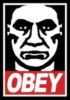
One concept for New Zealand First was abandoned by the designers when, despite many indications to the contrary, the client insisted it wasn't what they was after:

However, notoriously aged voter based of New Zealand First may be expanded by this nod to youth culture which still reflects the party's core values:

Click to enlarge
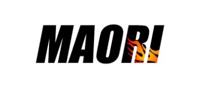
A proposal for the Maori Party appears to be based on the misunderstood claim that they are obsessed with race issues:

Whereas a suggestion for ACT reflect their recent parliamentary performance...

... in that when you look, ACT isn't there.
National's current leadership strategy of being all things to all people is reflected here:

But the most likely candidate for the National Party is this:

... the same old National, but positioned further to the left.
On the other side of the house, Scoop understands this concept

Click for big version
...was rejected within seconds of being downloaded, much like, in other quarters, this one was:

Click for big version
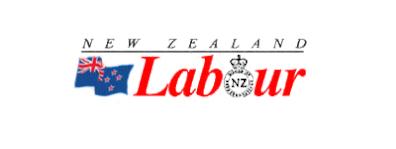
The current favourite for Labour at least saves space - they will only have to print the one logo on their election campaign material:

Elsewhere, having left United Future, Gordon Copeland plans to participate in a revived 'Future New Zealand' party. However, since Mr Dunne seems deterimined to hold on to the 'Future' bit, one proposal was a rebranding that better reflected both the tone and the prospects of the proposed party:

However, I have a suggestion that reflects the values and intentions of the people who voted Mr Copeland into his seat. I understand this one has recently come free:


 Martin LeFevre - Meditations: Animal Encounters During Meditative States
 Ian Powell: Gisborne Hospital Senior Doctors Strike Highlights Important Health System Issues
 Keith Rankin: Who, Neither Politician Nor Monarch, Executed 100,000 Civilians In A Single Night?
 Eugene Doyle: Writing In The Time Of Genocide
 Gordon Campbell: On Wealth Taxes And Capital Flight
 Ian Powell: Why New Zealand Should Recognise Palestine