Speight’s New Brand Design - the Pride of Dow
Media Release 1 November 2012
Speight’s New Brand Design - the Pride of Dow
Dow Design has recently completed a major branding and packaging project for Speight’s and their newly extended range. A New Zealand icon with a nationwide fan base, Speight’s Gold Medal Ale is the country’s most popular beer and Dow Design were employed to ensure the brand design reflects and retains the character to continue its reign.
Tasked to ensure the longevity of the market-leading Gold Medal Ale which is the heart of the Speight’s brand, Dow Design also developed the other sub brands into a cohesive unit to better communicate Speight’s core values. The extended Speight’s family represents over 20 years of product development from the brewers, between Speight’s Old Dark, released in 1991 and Speight’s Cider released in 2011 and consequently, label design personalities differed significantly.
Dow’s senior creative team of Donna McCort, Will Fletcher, Andrew Sparrow and Account Director Stephanie Perrett were invited to work with Lion on the project due to their history of producing impressive and commercially effective design for leading brands. The results of the project will begin appearing in beer fridges and chilly bins around the country this month.
Lion and Dow Design knew from consultation with consumers that any change in the Gold Medal Ale design would receive close scrutiny from Speight’s hard core fan base. “From its roots in the South, the Gold Medal Ale has earned a fiercely passionate following across the country, which we take very seriously,” explains Speight’s’ Marketing Manager, Jonte Goldwater. “Leading beer sales across New Zealand, Speight’s Gold Medal Ale is as popular as ever and we want to ensure it stays that way.”
Dow’s creative team established the key identifiers integral to the brand; these were the family traits that would need to be expressed across the entire range. “Identifying a hierarchy of visual elements in the Speight’s brand, we produced an enlivened design for the market-leading Gold Medal Ale and created brand consistency and cohesion for the Speight’s beer range,” says Dow’s Creative Director Donna McCort.
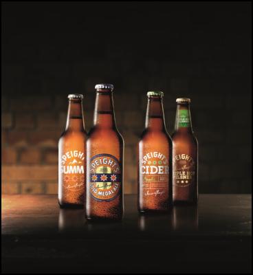
Refining the Gold Medal Ale labelling with subtle evolutionary adjustments, Dow Design emphasised the gold at the centre of the iconic roundel, and reduced the cluttered and less relevant combination of messages. The visual focus is now firmly on the leading elements; the arched logo across the top of the roundel, the triple stars, the signature of founder James Speight, and the statement ‘Master Brewers since 1878’ referring to the brand’s enduring history. A keen eye might also pick up an evolution in logo type.
Speight’s Summit Lager has also been brought into line in design terms. Summit now sports a traditional roundel and beer cues while remaining fresh and contemporary. Speight’s Cider made a significant impact on the cider market when introduced last summer. Design-wise it hadn’t strayed so far from the family line and with minor tweaks both brands will now be instantly recognisable as part of the collection.
The recently released Golden Pale Ale and Triple Hop Pilsner join the existing 5 Malt Old Dark and Distinction Ale to create a more comprehensive range of ‘craft beers for the mainstream market’. All share the quintessential roundel and gold foil elements on their clear self-adhesive labels, combined with bottle neck labels adding sophistication in strong, rich metallic colours.
Outer packaging has also received significant attention from Dow Design. New carton graphics give the range a stronger and more cohesive presence on the shelf, while expressing the true nature of each family member. The new design has been carried through to other consumer touch points including the beer taps in Speight’s Ale Houses, pubs and bars across New Zealand.
Speight’s reigns in
an intensely competitive field and the brand is set to
endure with its authentic icons now proudly displayed and
yet clearly distinguished, making it immediately
identifiable whichever brew is preferred.
--
Notes to editors
Established in 1993 by Annie Dow, Dow Design creates brands that people love and connect with. Dow Design produces entire brand environments across multiple marketing touch points. They are known for bridging the gap between cutting edge design and commercial sense.
As well as work on such well-known New Zealand brands as Columbine, DB Export, Hellers, Stafix, Fresh’n Fruity, Kapiti cheese, Primo and Vogel’s bread, Dow Design has also created corporate identities for brands including Veda Advantage, Kellands Real Estate and Robert Harris.
Dow was recently a finalist at the Best Awards for Best Effect, claiming a bronze award for Hellers for environmental design. They also won TVNZ NZ Marketing Award for their work on Anchor Strong with Fonterra, and the company recently received international recognition with a Summit International Platinum Award.

Click for big version.
ENDS


 Raise Communications: NZ Careers Expo Kicks Off National Tour Amid Record Unemployment
 Hugh Grant: How To Build Confidence In The Data You Collect
 Tourism Industry Aotearoa: TRENZ 2026 Set To Rediscover Auckland As It Farewells Rotorua - The Birthplace Of Tourism
 NIWA: Students Representing New Zealand At The ‘Olympics Of Science Fairs’ Forging Pathway For International Recognition
 Coalition to End Big Dairy: Activists Protest NZ National Dairy Industry Awards Again
 Infoblox: Dancing With Scammers - The Telegram Tango Investigation