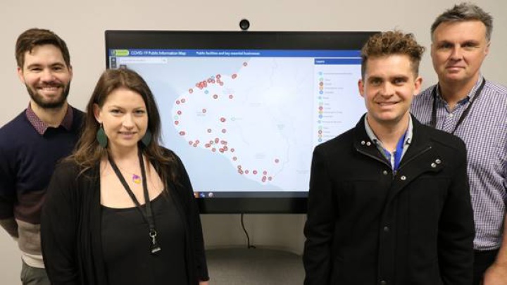
Covid-19 info map wins Ivy League praise for NPDC team

NPDC has been put on the map after its GIS work was praised by a Harvard University scholar for a clear and easy to understand public information map during the Covid-19 lockdown.
The four-strong team worked throughout the Alert Levels providing support to the Taranaki Emergency Management Office (TEMO) and Civil Defence by creating a map detailing what key public facilities and businesses were open. The map is ready to be used by TEMO again if the alert levels rise.
Matthew Leger, from Harvard’s Innovations in Government Programme, highlighted the map as an example of best practice in local government from across the world for how GIS is being applied to the Covid-19 response.
“COVID’s impact on public services and businesses alike continues to change on a daily basis,” Leger wrote.
“Businesses closing down or changing their hours can create confusion for residents looking for key services. To help keep people informed about changes in business operations, as well as the location of key services they can still access, officials in New Zealand built a map that categorizes businesses and other services by their open status.”
NPDC Chief Information Officer Steve McIntosh hailed the recognition for NPDC’s GIS experts and their work helping to break down complex information into easy to understand maps and graphics for the public and decision-makers.
“To feature in an Ivy League university’s report is a major achievement and we are delighted to see the GIS team getting kudos for their top work. The key is to help communicate what’s going on and what decisions need to be made by presenting data in an accessible way,” says Mr McIntosh.
The company behind the GIS map-making technology, ESRI, has also praised the Covid map and also highlighted the team’s work on the TSB Festival of Lights map as a great example of using effective design and GIS data to guide public through an event.
The 2019/20 summer was the first time the team has created an interactive map for the TSB Festival of Lights. The map included entrances to Pukekura Park, parking locations, information on the lighting displays and entertainment. The festival map featured in an online gallery showing the best maps from across the world made by GIS users at a recent ESRI conference attended virtually by about 80,000 people.
“We had a record-breaking TSB Festival of Lights season last summer and the number of people using the easy-to-use online map tripled as well from the previous summer. The map was a great way for visitors to navigate around the park and find their way to the light features and the awesome entertainment,” says Mr McIntosh.
What is GIS?
• GIS stands for Geographic Information Systems.
• GIS uses spatial data (information about a location) to create maps and graphics which explain complex issues to enable good decision making and communication.
• Hundreds of thousands of organisations in virtually every field are using GIS to make maps that communicate, perform analysis, share information and solve complex problems around the world.
• GIS started in the 1960s with the development of computers.
• NPDC’s GIS team first started in the early 2000s.


 Gordon Campbell: On What’s Wrong With The Treaty Principles Bill
 NZ National Party: National Acknowledges The Passing Of Hon Nikki Kaye
 Mana Mokopuna: Children And Young People Share Vital Insights On Healing From Family Violence And Sexual Violence In New Report
 NZ Government: PM Marks One Year In Government
 Helen Clark Foundation: Helen Clark Foundation Calls For Political Action To Reduce The Prevalence Of Junk Food And Improve Health Outcomes
 Justice Committee: Further Decisions About Submissions Process For The Principles Of The Treaty Of Waitangi Bill
 Infrastructure New Zealand: Single Agency Needed To Coordinate Climate Adaptation And Recovery


